


Scroobious is a venture-backed startup with the unique purpose of connecting underrepresented founders with angel investors. The goal is to create a human-centric and scalable online community where these founders can upload video pitches for investors to search and review - allowing them to invest in projects that match their interests/criteria. Scroobious has recently been highlighted in publications such as Business Insider.
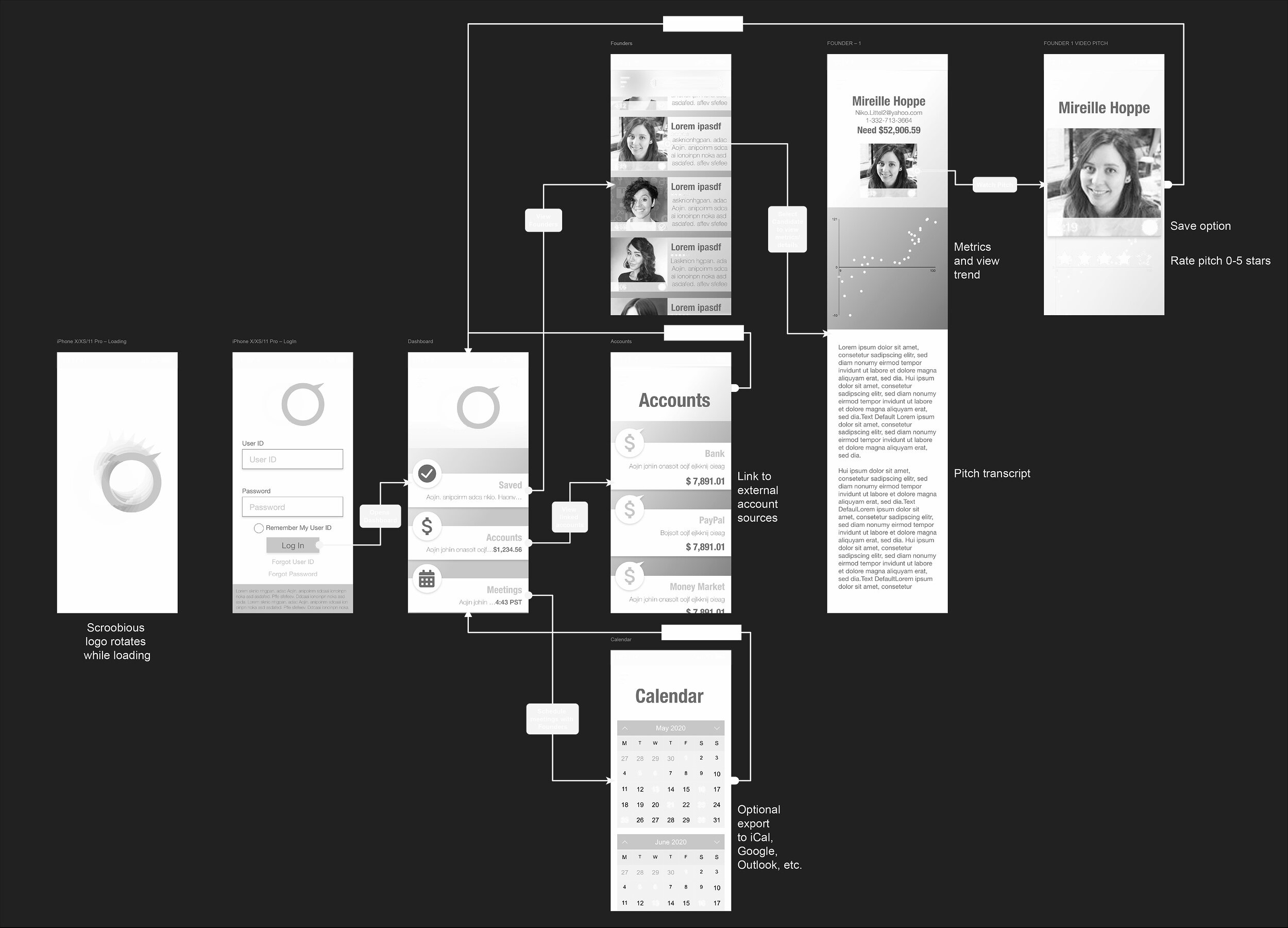
I designed the Visual Identity, UI, and UX for Scroobious. The focus of the platform is on video viewing, searching, and algorithmic matching software. The platform captures and shares viewing metrics to help investors and founders increase the likelihood of a successful and predictive match. There were a number of challenges that were discovered along the way that required iterative testing and revisions.
After completing detailed personas, user flows, and initial prototypes we found that the two target users required vastly different experiences. This was the most complex challenge with the project. We came to the final solution by creating two ‘dashboard’ designs. The founder’s and investor’s ‘dashboards’ were different from one another and focused on their specific needs respectively.
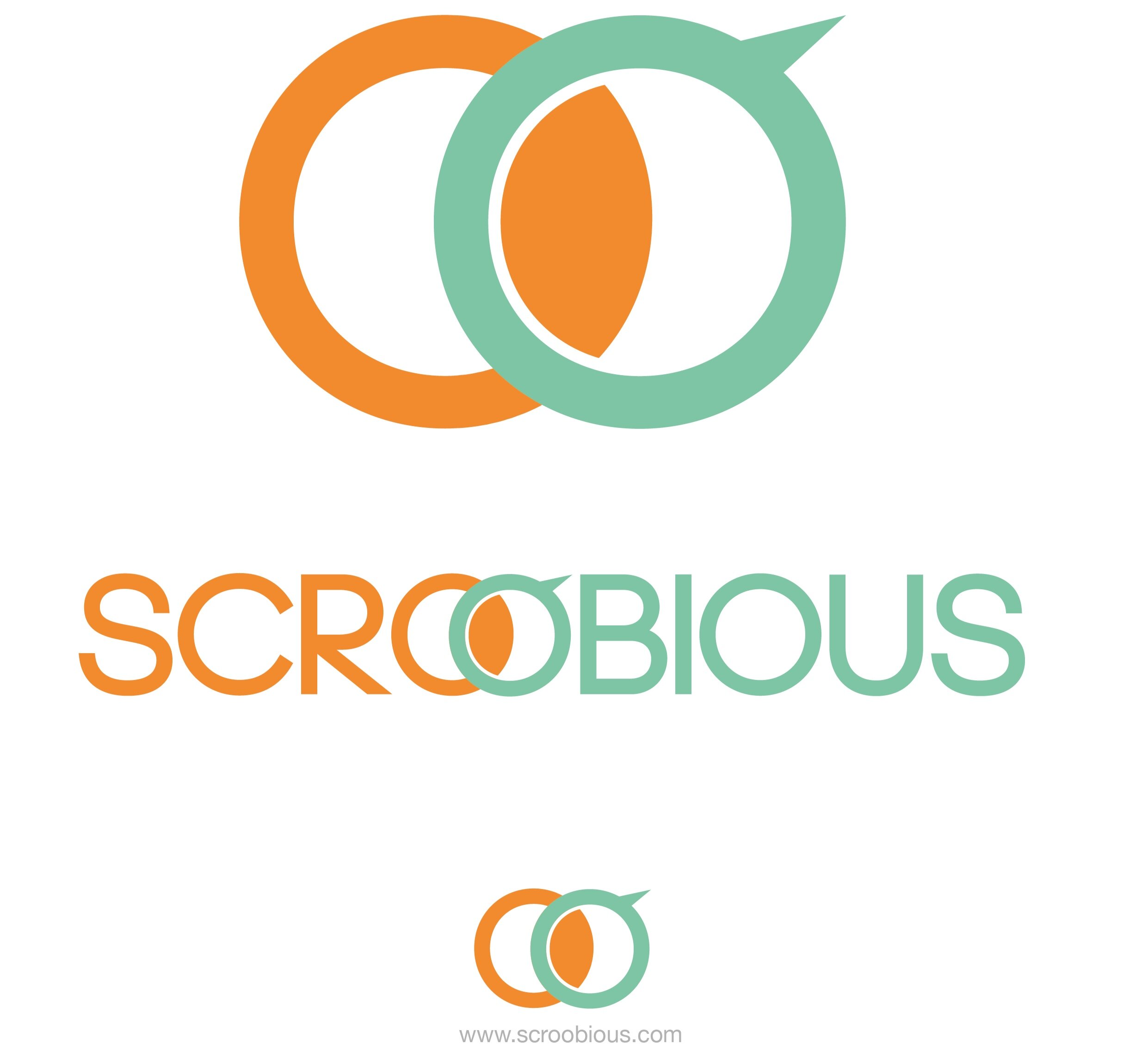
In order to design the organization’s identity, the co-founder and I discussed her inspiration behind the name and the project purpose. The name comes from the children’s poem by Edward Lear called “The Scroobious Pip” which is about a unique and unidentifiable creature that all other animals on earth fruitlessly attempt to classify. The logo subtly references this unique creature by combining the forms of an abstracted eye, horn, head, tail, and body.
The color palette was designed to have a subtle vibrancy inspired by natural elements - earth, water, and air.
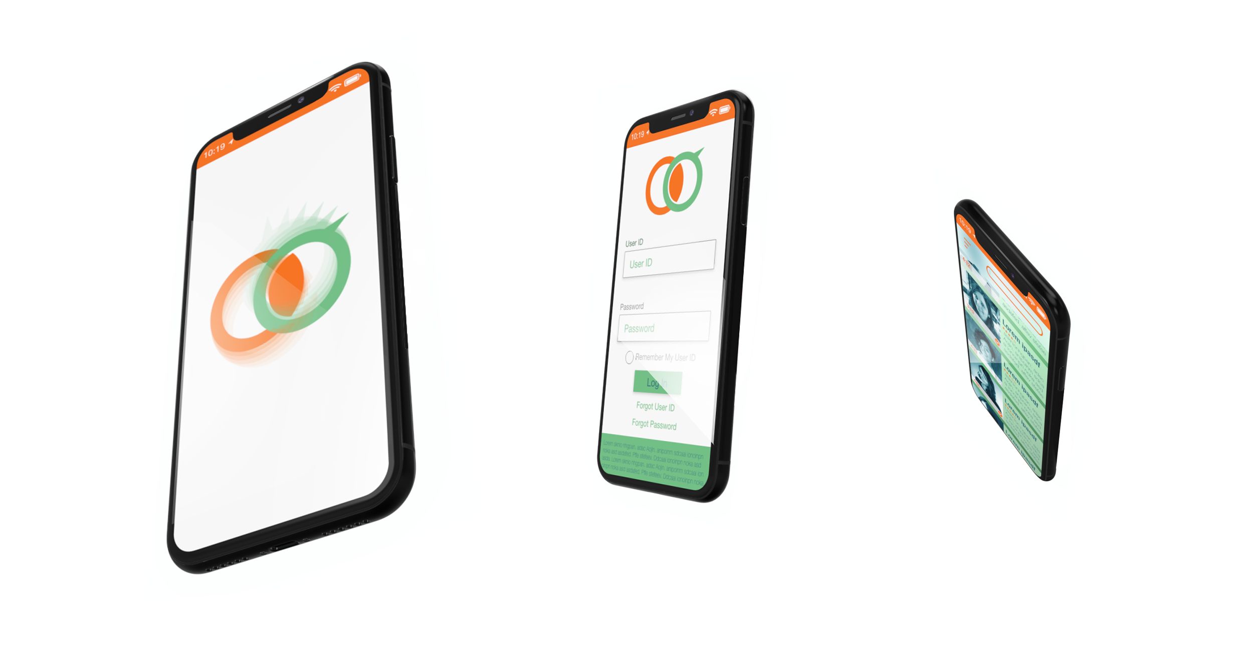
Mobile interface examples.
CI guidelines
Wireframe - This shows how the investor would navigate the mobile app and focus on video viewing and searches. We also found, through our testing and interviews with investors, that this path and experience must translate to the Desktop because of the high in-office activity. Whereas, the founders would prefer interactions through a mobile interface.